library(epipredict)
library(epiprocess)
library(epidatr)
library(data.table)
library(dplyr)
library(tidyr)
library(ggplot2)
library(magrittr)
library(purrr)
Backtesting is a crucial step in the development of forecasting models. It involves testing the model on historical data to see how well it performs. This is important because it allows us to see how well the model generalizes to new data and to identify any potential issues with the model. In the context of epidemiological forecasting, to do backtesting accurately, we need to account for the fact that the data available at the time of the forecast would have been different from the data available at the time of the backtest. This is because new data is constantly being collected and added to the dataset, which can affect the accuracy of the forecast.
For this reason, it is important to use version-faithful forecasting, where the model is trained on data that would have been available at the time of the forecast. This ensures that the model is tested on data that is as close as possible to what would have been available in real-time; training and making predictions on finalized data can lead to an overly optimistic sense of accuracy (see, for example, McDonald et al. (2021) and the references therein).
In the epiprocess package, we provide
epix_slide(), a function that allows a convenient way to
perform version-faithful forecasting by only using the data as it would
have been available at forecast reference time. In this vignette, we
will demonstrate how to use epix_slide() to backtest an
auto-regressive forecaster constructed using
arx_forecaster() on historical COVID-19 case data from the
US and Canada.
Getting case data from US states into an
epi_archive
First, we create an epi_archive() to store the version
history of the percentage of doctor’s visits with CLI (COVID-like
illness) computed from medical insurance claims and the number of new
confirmed COVID-19 cases per 100,000 population (daily) for 4 states
# Select the `percent_cli` column from the data archive
doctor_visits <- archive_cases_dv_subset$DT |>
  select(geo_value, time_value, version, percent_cli) |>
  tidyr::drop_na(percent_cli) |>
  as_epi_archive(compactify = TRUE)
The data can also be fetched from the Delphi Epidata API with the following query:
library(epidatr)
doctor_visits <- pub_covidcast(
  source = "doctor-visits",
  signals = "smoothed_adj_cli",
  geo_type = "state",
  time_type = "day",
  geo_values = "ca,fl,ny,tx",
  time_values = epirange(20200601, 20211201),
  issues = epirange(20200601, 20211201)
) |>
  rename(version = issue, percent_cli = value) |>
  as_epi_archive(compactify = TRUE)
issues is the name for version in the
Epidata API. In the interest of computational speed, we only use the 4
state dataset limited to 2020-2021, but the full archive can be used in
the same way and has performed well in the past.
We choose this dataset in particular partly because it is revision heavy; for example, here is a plot that compares monthly snapshots of the data.
Code for plotting
geo_choose <- "ca"
forecast_dates <- seq(from = as.Date("2020-08-01"), to = as.Date("2021-11-01"), by = "1 month")
percent_cli_data <- bind_rows(
  # Snapshotted data for the version-faithful forecasts
  map(
    forecast_dates,
    ~ doctor_visits |>
      epix_as_of(.x) |>
      mutate(version = .x)
  ) |>
    bind_rows() |>
    mutate(version_faithful = TRUE),
  # Latest data for the version-faithless forecasts
  doctor_visits |>
    epix_as_of(doctor_visits$versions_end) |>
    mutate(version_faithful = FALSE)
)

p0 <-
  ggplot(data = percent_cli_data |> filter(geo_value == geo_choose)) +
  geom_vline(aes(color = factor(version), xintercept = version), lty = 2) +
  geom_line(
    aes(x = time_value, y = percent_cli, color = factor(version)),
    inherit.aes = FALSE, na.rm = TRUE
  ) +
  scale_x_date(breaks = "2 months", date_labels = "%b %Y") +
  scale_y_continuous(expand = expansion(c(0, 0.05))) +
  labs(x = "Date", y = "smoothed, day of week adjusted covid-like doctors visits") +
  theme(legend.position = "none")
p0
#> Warning: Removed 544 rows containing missing values or values outside the scale range
#> (`geom_vline()`).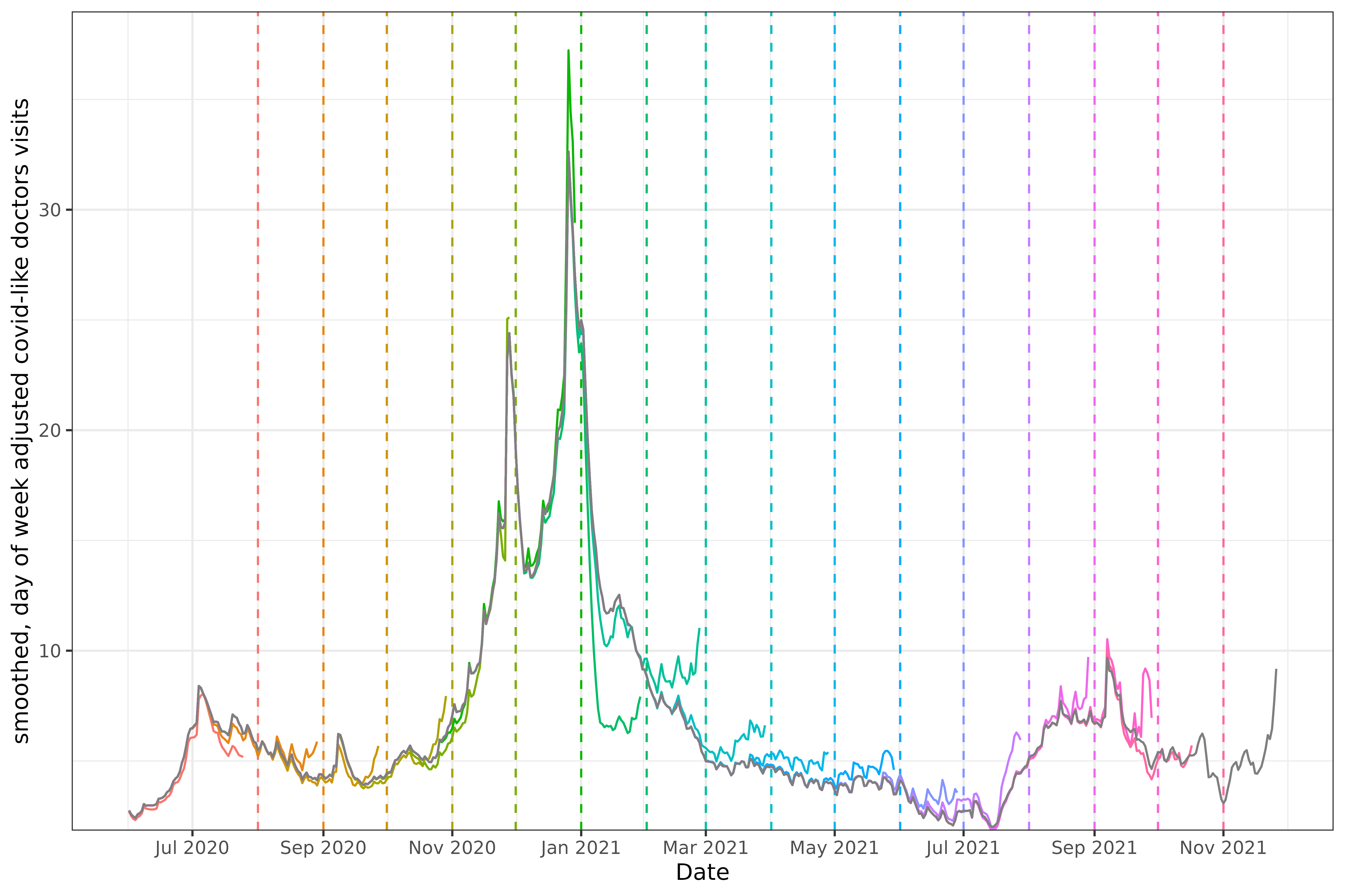
The snapshots are taken on the first of each month, with the vertical
dashed line representing the sample date for the time series of the
corresponding color. For example, the snapshot on March 1st, 2021 is
aquamarine, and increases to slightly over 10. Every series is
necessarily to the left of the snapshot date (since all known values
must happen before the snapshot is taken1). The grey line at the
center of all the various snapshots represents the “final value”, which
is just the snapshot at the last version in the archive (the
versions_end).
Comparing with the grey line tells us how much the value at the time
of the snapshot differs with what was eventually reported. The drop in
January 2021 in the snapshot on 2021-02-01 was initially
reported as much steeper than it eventually turned out to be, while in
the period after that the values were initially reported as higher than
they actually were.
A feature that is common in both real-time forecasting and
retrospective forecasting is data latency. Looking at the very first
snapshot, 2020-08-01 (the red dotted vertical line), there
is a noticeable gap between the forecast date and the end of the red
time-series to its left. In fact, if we take a snapshot and get the last
time_value:
doctor_visits |>
  epix_as_of(as.Date("2020-08-01")) |>
  pull(time_value) |>
  max()
#> [1] "2020-07-25"
The last day of data is the 25th, a entire week before
2020-08-01. This can require some effort to work around,
especially if the latency is variable; see
step_adjust_latency() for some methods included in this
package. Much of that functionality is built into
arx_forecaster() using the parameter
adjust_ahead, which we will use below.
Backtesting a simple autoregressive forecaster
One of the most common use cases of
epiprocess::epi_archive() object is for accurate model
back-testing.
To start, let’s use a simple autoregressive forecaster to predict the
percentage of doctor’s hospital visits with CLI (COVID-like illness)
(percent_cli) 14 days in the future. For increased accuracy
we will use quantile regression.
Comparing a single day and ahead
As a sanity check before we backtest the entire dataset, let’s look
at forecasting a single day in the middle of the dataset. One way to do
this is by setting the .version argument for
epix_slide():
forecast_date <- as.Date("2021-04-06")
forecasts <- doctor_visits |>
  epix_slide(
    ~ arx_forecaster(
      .x,
      outcome = "percent_cli",
      predictors = "percent_cli",
      args_list = arx_args_list()
    )$predictions |>
      pivot_quantiles_wider(.pred_distn),
    .versions = forecast_date
  )
As truth data, we’ll compare with the epix_as_of() to
generate a snapshot of the archive at the last date2.
forecasts |>
  inner_join(
    doctor_visits |>
      epix_as_of(doctor_visits$versions_end),
    by = c("geo_value", "target_date" = "time_value")
  ) |>
  select(geo_value, forecast_date, .pred, `0.05`, `0.95`, percent_cli)
#> # A tibble: 4 × 6
#>   geo_value forecast_date .pred `0.05` `0.95` percent_cli
#>   <chr>     <date>        <dbl>  <dbl>  <dbl>       <dbl>
#> 1 ca        2021-04-03     6.79  2.63   11.0         4.06
#> 2 fl        2021-04-03     7.40  3.23   11.6         5.10
#> 3 ny        2021-04-03     8.05  3.88   12.2         6.92
#> 4 tx        2021-04-03     5.00  0.836   9.17        3.25
.pred corresponds to the point forecast (median) and the
0.05, 0.95 correspond to those respective
quantiles. The forecasts fall within the prediction interval, so our
implementation passes a simple validation.
Comparing version faithful and version faithless forecasts
Now let’s go ahead and slide this forecaster in a version faithless
way and a version faithful way. For the version faithless way, to still
use epix_slide to do the backtesting we need to snapshot
the latest version of the data, and then make a faux archive by setting
version = time_value3. This has the effect of simulating a data
set that receives the final version updates every day.
archive_cases_dv_subset_faux <- doctor_visits |>
  epix_as_of(doctor_visits$versions_end) |>
  mutate(version = time_value) |>
  as_epi_archive()
For the version faithful way, we will simply use the true
epi_archive object. To reduce typing, we’ll create
forecast_wrapper() to cover mapping across aheads and some
variations we will use later.
forecast_wrapper <- function(
    epi_data, aheads, outcome, predictors,
    process_data = identity) {
  map(
    aheads,
    \(ahead) {
      arx_forecaster(
        process_data(epi_data), outcome, predictors,
        args_list = arx_args_list(
          ahead = ahead,
          lags = c(0:7, 14, 21),
          adjust_latency = "extend_ahead"
        )
      )$predictions |>
        pivot_quantiles_wider(.pred_distn)
    }
  ) |>
    bind_rows()
}
Note that we have used the parameteradjust_latency
mentioned above, which comes up because on any given forecast date, such
as 2020-08-01 the latest data to be released may be several
days old. adjust_latency will modify the forecaster to
compensate4. See the function
step_adjust_latency() for more details and examples.
And now we generate the forecasts for both the version faithful and faithless archives, and bind the results together.
forecast_dates <- seq(
  from = as.Date("2020-09-01"),
  to = as.Date("2021-11-01"),
  by = "1 month"
)
aheads <- c(1, 7, 14, 21, 28)

version_faithless <- archive_cases_dv_subset_faux |>
  epix_slide(
    ~ forecast_wrapper(.x, aheads, "percent_cli", "percent_cli"),
    .before = 120,
    .versions = forecast_dates
  ) |>
  mutate(version_faithful = FALSE)

version_faithful <- doctor_visits |>
  epix_slide(
    ~ forecast_wrapper(.x, aheads, "percent_cli", "percent_cli"),
    .before = 120,
    .versions = forecast_dates
  ) |>
  mutate(version_faithful = TRUE)

forecasts <-
  bind_rows(
    version_faithless,
    version_faithful
  )
Here, arx_forecaster() does all the heavy lifting. It
creates leads of the target (respecting time stamps and locations) along
with lags of the features (here, the response and doctors visits),
estimates a forecasting model using the specified engine, creates
predictions, and non-parametric confidence bands.
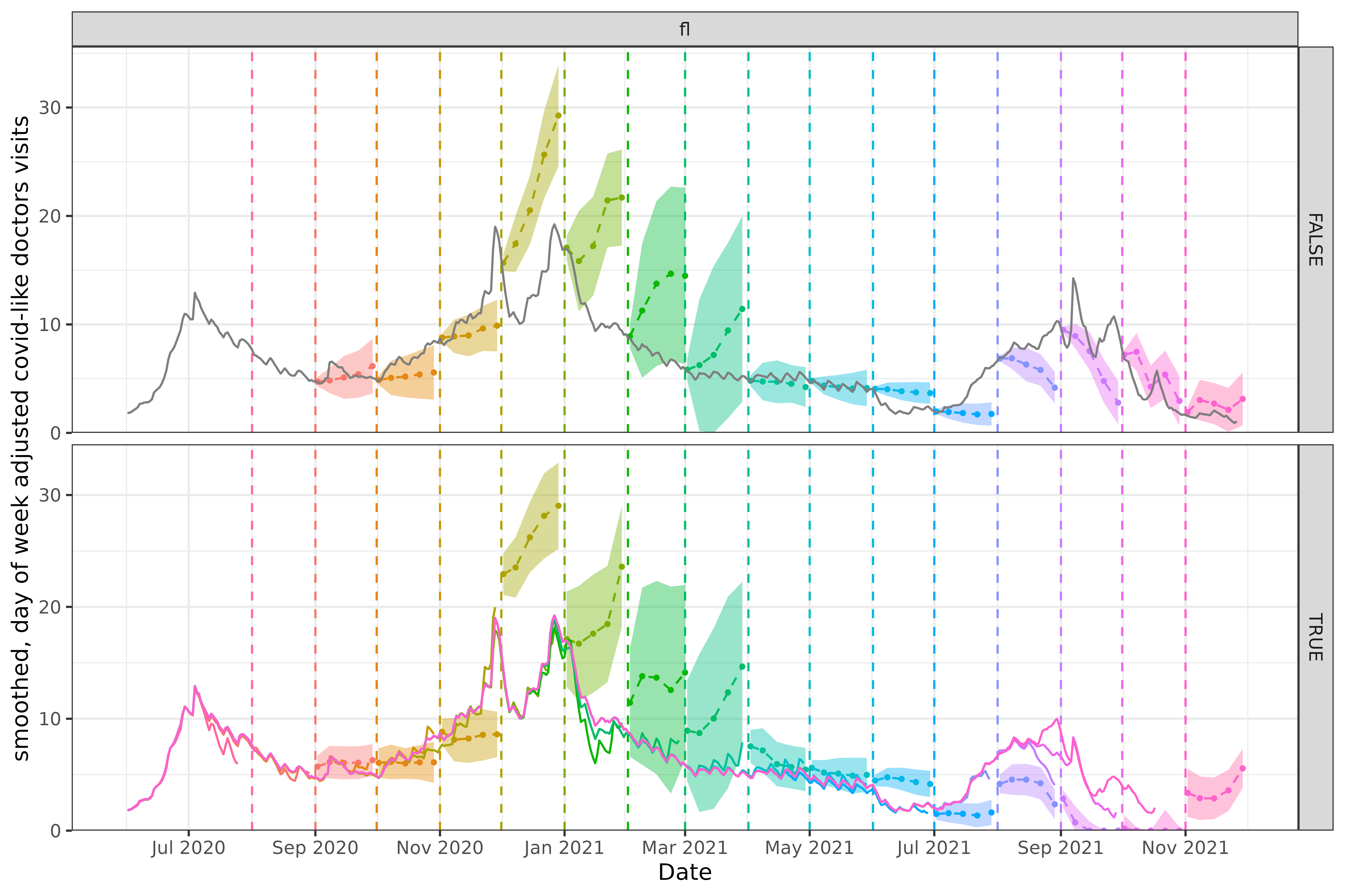
To see how the predictions compare, we plot them on top of the latest case rates, using the same versioning plotting method as above. Note that even though we’ve fitted the model on four states (ca, fl, tx, and ny), we’ll just display the results for two states, California (CA) and Florida (FL), to get a sense of the model performance while keeping the graphic simple.
Code for plotting
geo_choose <- "ca"
forecasts_filtered <- forecasts |>
  filter(geo_value == geo_choose) |>
  mutate(time_value = version)

p1 <- # first plotting the forecasts as bands, lines and points
  ggplot(data = forecasts_filtered, aes(x = target_date, group = time_value)) +
  geom_ribbon(aes(ymin = `0.05`, ymax = `0.95`, fill = factor(time_value)), alpha = 0.4) +
  geom_line(aes(y = .pred, color = factor(time_value)), linetype = 2L) +
  geom_point(aes(y = .pred, color = factor(time_value)), size = 0.75) +
  # the forecast date
  geom_vline(data = percent_cli_data |> filter(geo_value == geo_choose) |> select(-version_faithful), aes(color = factor(version), xintercept = version), lty = 2) +
  # the underlying data
  geom_line(
    data = percent_cli_data |> filter(geo_value == geo_choose),
    aes(x = time_value, y = percent_cli, color = factor(version)),
    inherit.aes = FALSE, na.rm = TRUE
  ) +
  facet_grid(version_faithful ~ geo_value, scales = "free") +
  scale_x_date(breaks = "2 months", date_labels = "%b %Y") +
  scale_y_continuous(expand = expansion(c(0, 0.05))) +
  labs(x = "Date", y = "smoothed, day of week adjusted covid-like doctors visits") +
  theme(legend.position = "none")
geo_choose <- "fl"
forecasts_filtered <- forecasts |>
  filter(geo_value == geo_choose) |>
  mutate(time_value = version)

p2 <-
  ggplot(data = forecasts_filtered, aes(x = target_date, group = time_value)) +
  geom_ribbon(aes(ymin = `0.05`, ymax = `0.95`, fill = factor(time_value)), alpha = 0.4) +
  geom_line(aes(y = .pred, color = factor(time_value)), linetype = 2L) +
  geom_point(aes(y = .pred, color = factor(time_value)), size = 0.75) +
  geom_vline(
    data = percent_cli_data |> filter(geo_value == geo_choose) |> select(-version_faithful),
    aes(color = factor(version), xintercept = version), lty = 2
  ) +
  geom_line(
    data = percent_cli_data |> filter(geo_value == geo_choose),
    aes(x = time_value, y = percent_cli, color = factor(version)),
    inherit.aes = FALSE, na.rm = TRUE
  ) +
  facet_grid(version_faithful ~ geo_value, scales = "free") +
  scale_x_date(breaks = "2 months", date_labels = "%b %Y") +
  scale_y_continuous(expand = expansion(c(0, 0.05))) +
  labs(x = "Date", y = "smoothed, day of week adjusted covid-like doctors visits") +
  theme(legend.position = "none")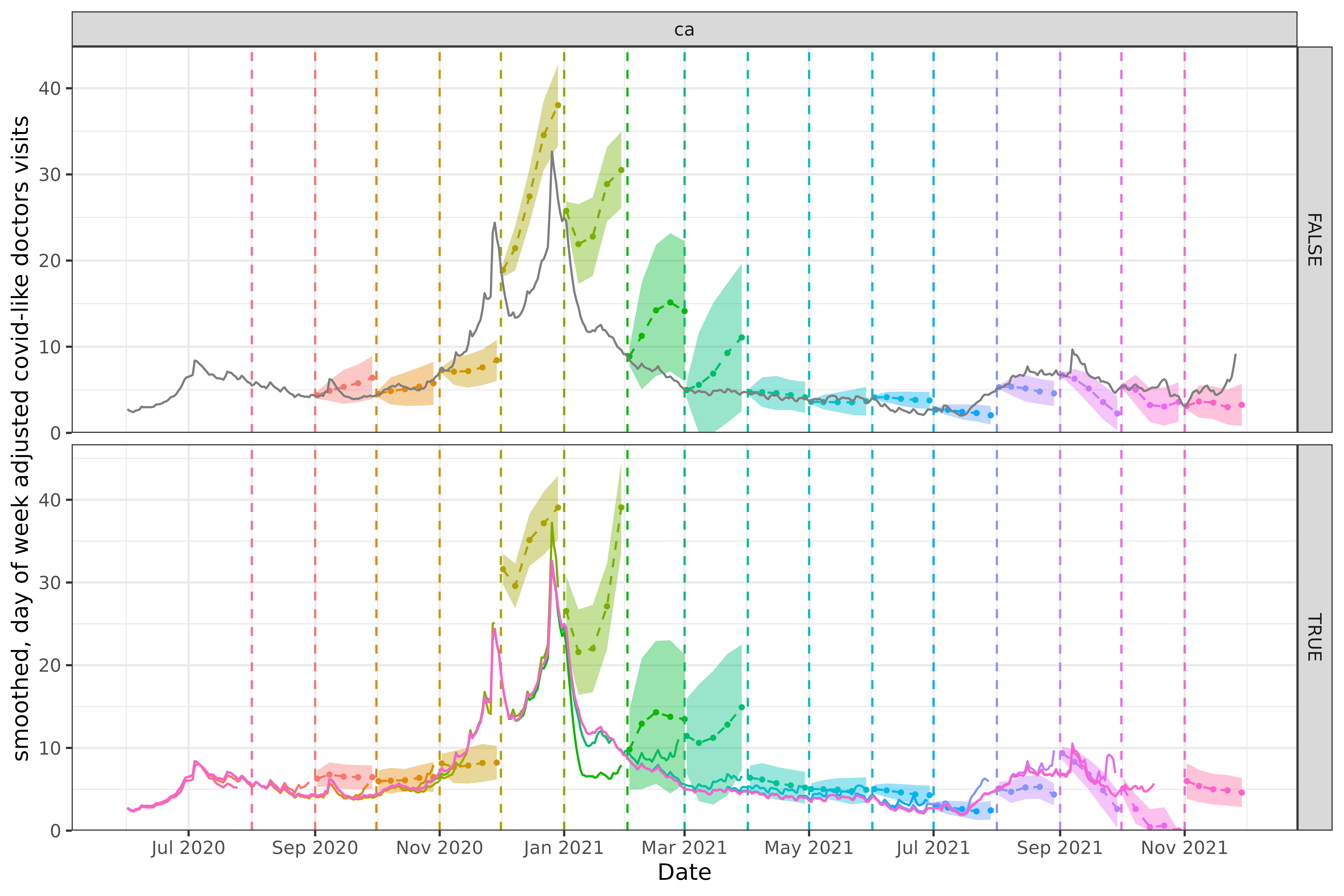
For California above and Florida below, neither approach produces amazingly accurate forecasts. The difference between the forecasts produced is quite striking however, especially in the single day ahead forecasts.
In the version faithful case for California above, the December 2020 forecast starts at nearly 30, whereas the equivalent version faithless forecast at least starts at the correct value, even if it is overly pessimistic about the eventual peak that will occur.
In the version faithful case for Florida below, the late 2021 forecasts, such as September are wildly off base, routinely estimating zero cases, thanks to the versioned data systematically under-reporting. There is a similar if somewhat less extreme effect on December 2020 as in California.
Without using the data as you would have seen it at the time as in the version faithful case, you potentially have no insight into what kind of performance you can expect in practice.